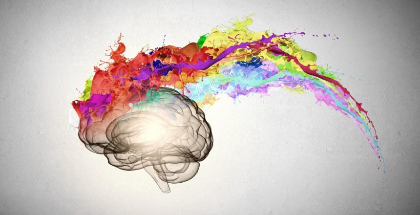
Color Psychology in Marketing
Color psychology is the study of how color influences our behavior and decision-making. In marketing, color can be used to impact the way customers perceive and experience your brand. Different colors have characteristics that can spark certain emotions and feelings, and even drive a customer’s purchasing decisions. Colors bring attention to your brand, give assurances about your company, and affect the brain’s emotional sensors even without your audience realizing. The colors that represent you differentiate your brand from other companies in your industry.
It’s important to choose the right color scheme in your marketing strategy so it tells your story in a positive and accurate way, otherwise you exude the wrong impression from the beginning.
Every color has positive and negative connotations depending on its specific shade, hue, or tone. What is the feeling, mood, or image that you want your brand to portray? Do the colors you’ve chosen represent your brand’s personality well?
Some of the most common hues used in marketing and design, along with their general attributes, are as follows:
Red can be used to foster a sense of urgency and encourages appetite, hence being utilized often by fast food restaurants and sales. It is associated with power, passion, and energy but can also mean danger, aggression or pain. For those with a bold and energetic brand, you may consider incorporating shades of red into your style guide.
Orange combines red’s energy with yellow’s friendliness and fun. It also stimulates appetite and represents physical comfort and playfulness. Overall, orange embodies impulsiveness, enthusiasm, and a positive vibe.
Yellow is generally considered a joyful, warm, and happy hue, giving your brand a youthful vibrance and playfulness. Too much yellow can prompt anxiety, though, so use your best judgment.
Green can be used to encourage relaxation and tranquility, and is associated with health, the environment, harmony, nature, and even finance. It can also be used as a sign of growth and wellness.
Blue is used to spark a spectrum of emotions, but is mostly known for dependability, loyalty, trust, and is mentally soothing. It can be used for relaxation and to put minds at ease, but also signifies that your brand might be trustworthy and secure. Blue encourages productivity and suppressed the appetite, so if you’re in the food industry, you may want to think twice before incorporating it strongly into your brand.
Purple is the color of royalty and has been used to represent spirituality and holistic wellness as well. It can prompt problem solving, creativity, and imagination. It is generally considered a feminine or regal color so keep that in mind when using it for your brand.
Black, when used the right way, can represent sophistication, strength, and authority. Be careful, though, because it can also symbolize evil, sadness, or even death. It just goes to show that context and balance are important! It can be part of a clean looking layout and add high contrast in design, but can be seen negatively if used too much in visuals rather than text.
White can represent cleanliness and is used frequently in design aiming for a modern and sleek aesthetic. It is the symbol of purity, innocence, and simplicity. If used incorrectly in your designs, white can result in a brand that lacks personality or creativity.
As previously stated, different colors can be used by brands to conjure a variety of reactions and emotions for an audience, ultimately influencing them to trust your business or not. Make sure to thoughtfully consider how you’d best like your brand represented and use colors with characteristics that embody it.
Are you looking to create a new brand or rebrand an existing one? CAST Design Team specializes in Branding. We’ve worked with small and large enterprises around the world to perfect their brand. Reach out today for a free consult to learn more about how we can help you.


